Creative direction navigated strict packaging regulations while establishing a scalable design system for diverse sizes and flavors. These systems educate consumers, boost shelf presence and provide branding for pop-ups and trade shows.


Creative direction navigated strict packaging regulations while establishing a scalable design system for diverse sizes and flavors. These systems educate consumers, boost shelf presence and provide branding for pop-ups and trade shows.

Creative direction navigated strict packaging regulations while establishing a scalable design system for diverse sizes and flavors. These systems educate consumers, boost shelf presence and provide branding for pop-ups and trade shows.

Creative direction navigated strict packaging regulations while establishing a scalable design system for diverse sizes and flavors. These systems educate consumers, boost shelf presence and provide branding for pop-ups and trade shows.


Creative direction navigated strict packaging regulations while establishing a scalable design system for diverse sizes and flavors. These systems educate consumers, boost shelf presence and provide branding for pop-ups and trade shows.

Creative direction navigated strict packaging regulations while establishing a scalable design system for diverse sizes and flavors. These systems educate consumers, boost shelf presence and provide branding for pop-ups and trade shows.
Creative direction navigated strict packaging regulations while establishing a scalable design system for diverse sizes and flavors. These systems educate consumers, boost shelf presence and provide branding for pop-ups and trade shows.


Creative direction navigated strict packaging regulations while establishing a scalable design system for diverse sizes and flavors. These systems educate consumers, boost shelf presence and provide branding for pop-ups and trade shows.


Creative direction navigated strict packaging regulations while establishing a scalable design system for diverse sizes and flavors. These systems educate consumers, boost shelf presence and provide branding for pop-ups and trade shows.


Creative direction navigated strict packaging regulations while establishing a scalable design system for diverse sizes and flavors. These systems educate consumers, boost shelf presence and provide branding for pop-ups and trade shows.

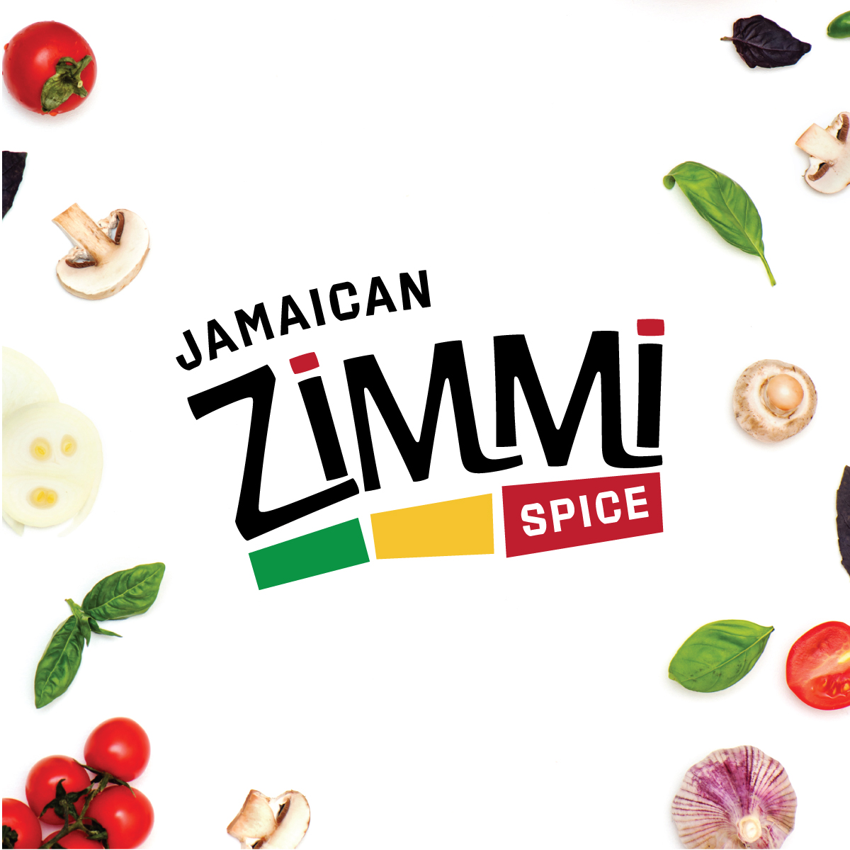
Humboldt Homegrown is a Northern California cannabis brand rooted in the region’s legacy of craft cultivation. The project required translating this heritage into a retail-ready identity, packaging, POP displays, and digital experiences that resonate with consumers while meeting strict regulatory requirements.
* Navigating strict California cannabis regulations for packaging, labeling, and child-resistant formats.
* Designing scalable systems to manage multiple SKUs, flavors, and product formats without losing cohesion.
* Ensuring production efficiency through automated print and labeling workflows.
* Designing POP display boxes and in-store collateral that maintain consistency with packaging identity.
* Incorporating sustainability-focused materials without compromising premium shelf presence.
* Coordinating retail assets (menu boards, flavor displays, POS graphics) to match packaging and display design.
* Establish a cohesive design system capable of scaling across new markets and product categories.
* Create packaging architecture aligned with compliance, production constraints, and automated labeling technologies.
* Develop a consistent visual identity that could flex across strains, SKUs, and retail environments.
* Design POP display boxes that reinforce brand identity, attract attention on shelves, and improve product visibility.
* Ensure materials, formats, and workflows supported sustainability and cost-efficient growth.
* Build a foundation that positioned the brand for future multi-state expansion and national retail presence.
Deep dive into brand goals, competitive positioning, consumer insights, and retail expectations. Conducted a full review of packaging, labeling, and POP display requirements to ensure the system aligned with regulations and production realities.
1. Learn as much as possible about the target audience
2. Learn as much as possible about compliance standards
3. Understand current solutions and the competitive landscape
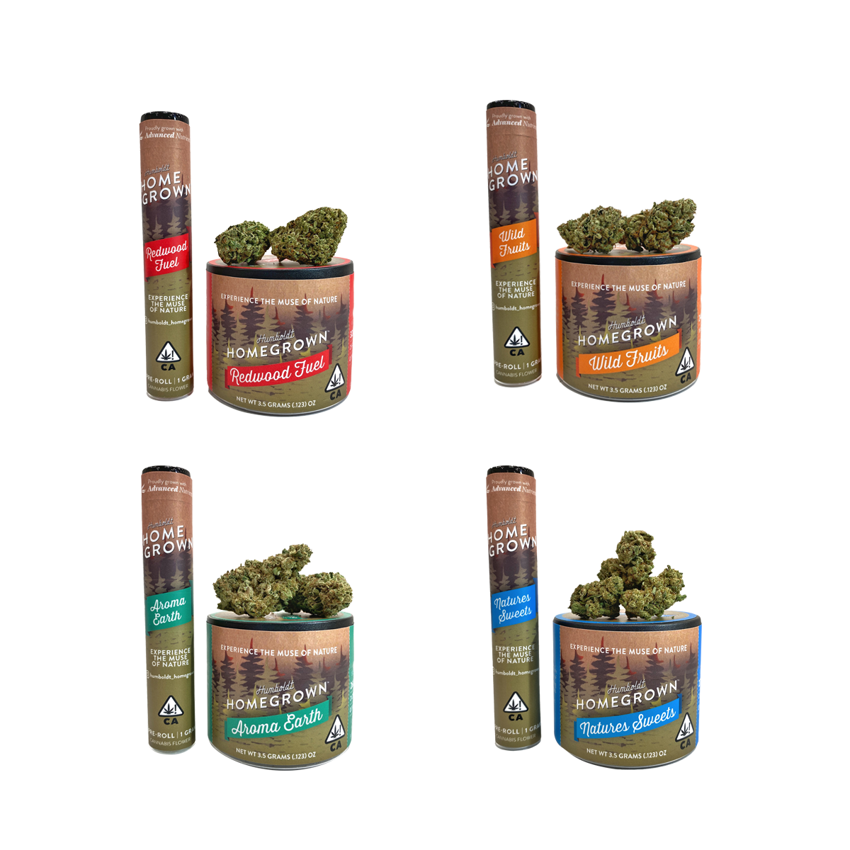
Developed an adaptable identity system including typography, color architecture, iconography, and hierarchy rules. Built the foundation for a scalable, multi-SKU brand that could flex across packaging, POP displays, and retail signage.
Created dielines, labeling templates, and automated production workflows for SKUs and POP display boxes. Defined material specs, sustainability considerations, and vendor-ready print requirements. Managed vendor relations.
Applied the system across packaging, POP display boxes, label variations, retail signage, menu boards, digital graphics, and POS assets. Ensured consistent brand expression across every touchpoint.
Completed final proofing, color verification, and regulatory review. Prepared print-ready files, coordinated vendor checks, and delivered guidelines for a smooth retail rollout.
To celebrate five years, OCSA sought a special, artistic version of its logo. Wood was blended into the logo’s color blocks as a nod to the five-year anniversary—it’s the traditional gift, symbolizing strength and steady growth.
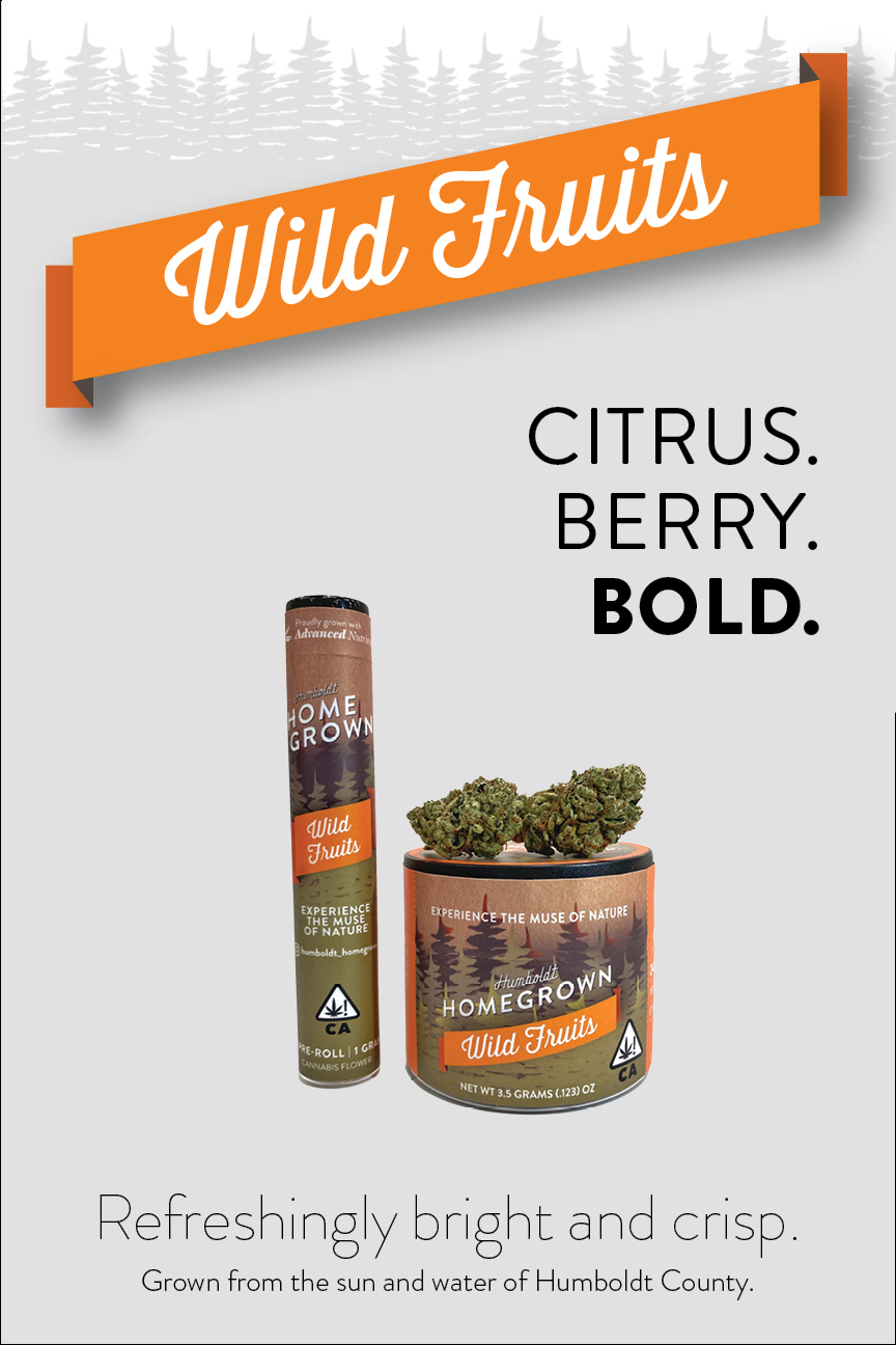
Creative direction navigated strict packaging regulations while establishing a scalable design system for diverse sizes and flavors. These systems educate consumers, boost shelf presence and provide branding for pop-ups and trade shows.
Created an immersive booth inspired by Humboldt’s landscapes using wood and greenery. Designed cohesive event promotions to ensure brand consistency across physical and digital platforms. Designed branding and retail displays to enhance recognition and stand out in competitive markets.


Developed packaging systems with variable data for automation, ensuring consistency across product SKUs and multifunctional shipper/POP display boxes.


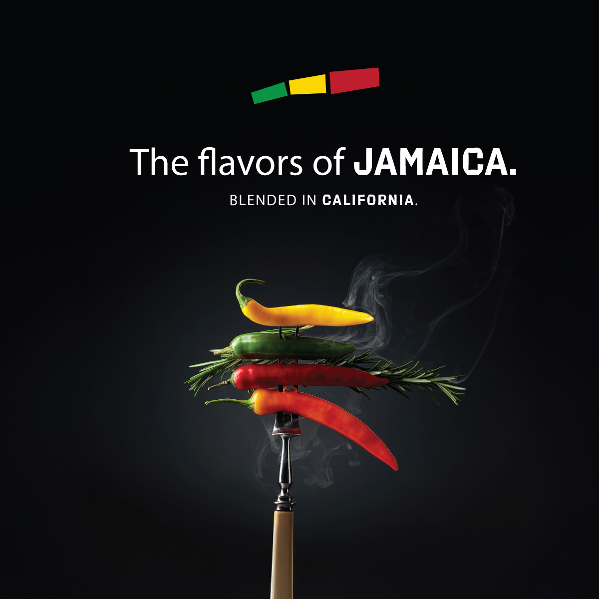
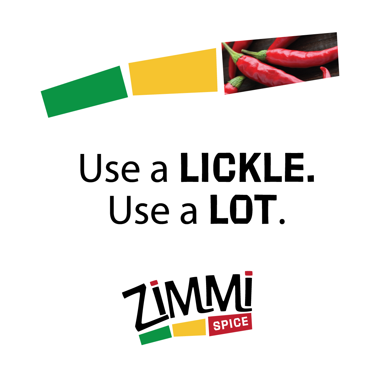
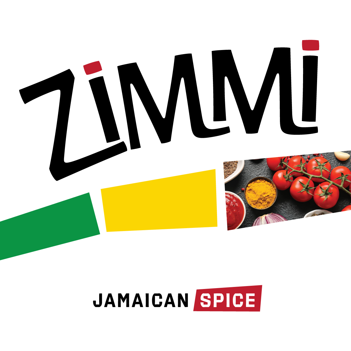
Marketing materials were designed to showcase flavor categories and the significance of the location where the product was produced. A consistent design system was created and applied across subsequent projects.