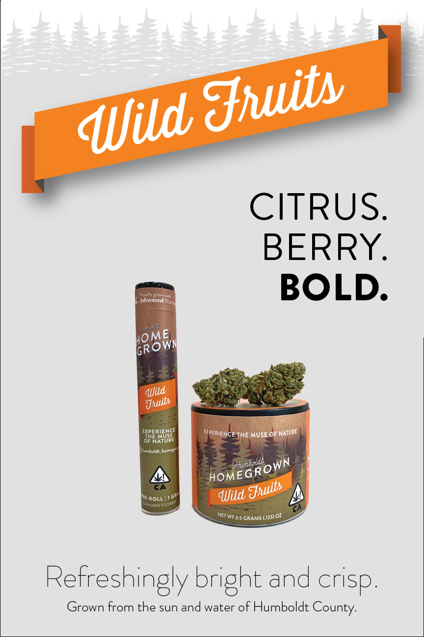
Creative direction navigated strict packaging regulations while establishing a scalable design system for diverse sizes and flavors. These systems educate consumers, boost shelf presence and provide branding for pop-ups and trade shows.


Creative direction navigated strict packaging regulations while establishing a scalable design system for diverse sizes and flavors. These systems educate consumers, boost shelf presence and provide branding for pop-ups and trade shows.

Creative direction navigated strict packaging regulations while establishing a scalable design system for diverse sizes and flavors. These systems educate consumers, boost shelf presence and provide branding for pop-ups and trade shows.

Creative direction navigated strict packaging regulations while establishing a scalable design system for diverse sizes and flavors. These systems educate consumers, boost shelf presence and provide branding for pop-ups and trade shows.


Creative direction navigated strict packaging regulations while establishing a scalable design system for diverse sizes and flavors. These systems educate consumers, boost shelf presence and provide branding for pop-ups and trade shows.

Creative direction navigated strict packaging regulations while establishing a scalable design system for diverse sizes and flavors. These systems educate consumers, boost shelf presence and provide branding for pop-ups and trade shows.
Creative direction navigated strict packaging regulations while establishing a scalable design system for diverse sizes and flavors. These systems educate consumers, boost shelf presence and provide branding for pop-ups and trade shows.


Creative direction navigated strict packaging regulations while establishing a scalable design system for diverse sizes and flavors. These systems educate consumers, boost shelf presence and provide branding for pop-ups and trade shows.


Creative direction navigated strict packaging regulations while establishing a scalable design system for diverse sizes and flavors. These systems educate consumers, boost shelf presence and provide branding for pop-ups and trade shows.


Creative direction navigated strict packaging regulations while establishing a scalable design system for diverse sizes and flavors. These systems educate consumers, boost shelf presence and provide branding for pop-ups and trade shows.

Creative direction navigated strict packaging regulations while establishing a scalable design system for diverse sizes and flavors. These systems educate consumers, boost shelf presence and provide branding for pop-ups and trade shows.
Creative direction navigated strict packaging regulations while establishing a scalable design system for diverse sizes and flavors. These systems educate consumers, boost shelf presence and provide branding for pop-ups and trade shows.
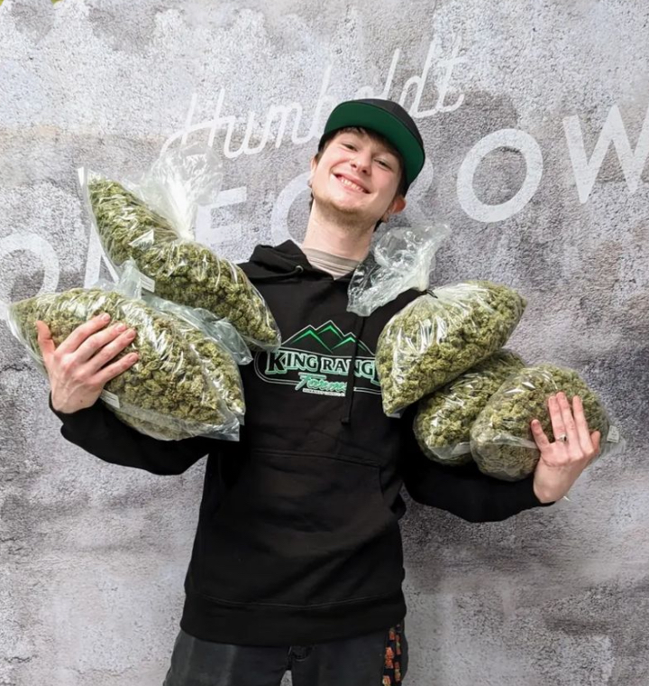
Created an immersive booth inspired by Humboldt’s landscapes using wood and greenery. Designed cohesive event promotions to ensure brand consistency across physical and digital platforms. Designed branding and retail displays to enhance recognition and stand out in competitive markets.

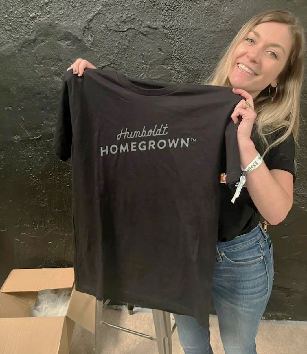


 Branding


Developed packaging systems with variable data for automation, ensuring consistency across product SKUs and multifunctional shipper/POP display boxes.


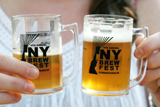
Heartland Brewery launched a refreshed brand identity for Brewfest, featuring targeted ads, dynamic signage, immersive experiences, and a custom map and directional system to guide attendees across Governors Island’s expansive event space.
Created an immersive booth inspired by Humboldt’s landscapes using wood and greenery. Designed cohesive event promotions to ensure brand consistency across physical and digital platforms. Designed branding and retail displays to enhance recognition and stand out in competitive markets.


Marketing materials were designed to showcase flavor categories and the significance of the location where the product was produced. A consistent design system was created and applied across subsequent projects.